Hey again!
Today we're here to talk about our UI again, more specifically our game's final logo, as well as its design process.
First concepts and brainstorming
The general way to go for figuring out a game logo is to take elements from the game and add it into the logo, the icon or both. This makes the logo more original and personal, as what is depicted in there is present in the game, while hopefully making the game stand out more too!
We already had a main concept for the title font, which was made to imitate a letter, as the title is "My Rosemary".
For My Rosemary, we decided to first figure out the key points that we coudl use.
We had three different main ideas:
- Lockpick - This was the first thought that came to our minds. This did not last long, as we could not find a good way to fit a big circular lock into a delicate title, so it was scrapped.
- Rosemary herself - This idea did not last long, as it was too much noise to add to the resto of the title, which would not provide much improvement to the title, so it too was scrapped.
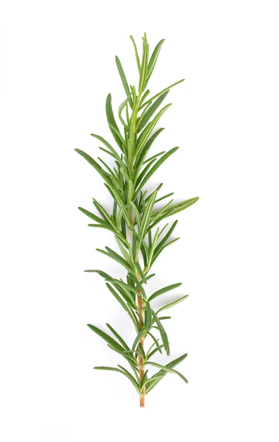
- A Rosemary branch - This was our last and best idea! A rosemary branch emerging from the last "Y" in My Rosemary. This was both simple and effective, and we stuck with it.

A rosemary branch
Logo developing
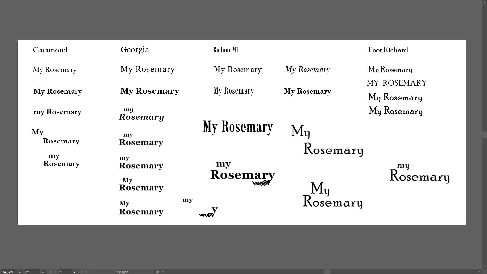
After figuring out what our logo was going to have, we decided to experiment with some more typography and branch positioning. Here is our typography process along with the almost final logo, only missing color:

A collection of different options for our logo.
Current Logo
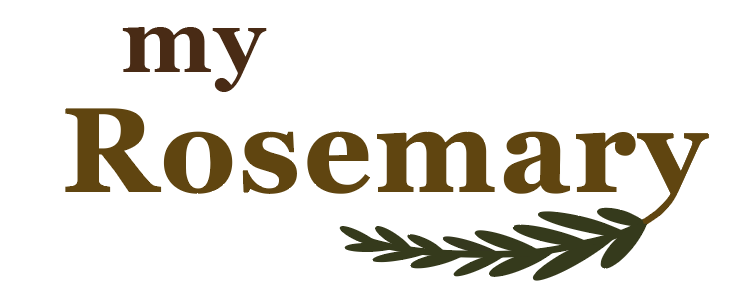
After choosing the form, we had to color our logo. We decided to have the branch have its green color, with the letters having some warm brownish colors, to reflect the old book feeling our game emanates.
Here is the current logo:

The current logo.
Our logo will still go through more changes as we implement and test how it looks better in-game, which will be posted here later down the line.
And that's all for this one!
See you again soon,
Nymeus Studio


