Hello, indieDB Community!
This is our 5th article about our in-development game called Búzio.
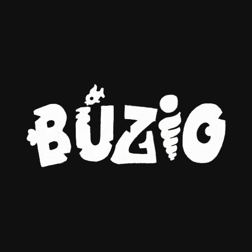
In this article, we want to show our Game's Logo Studies.
This is the Logo that we will be using in Búzio.
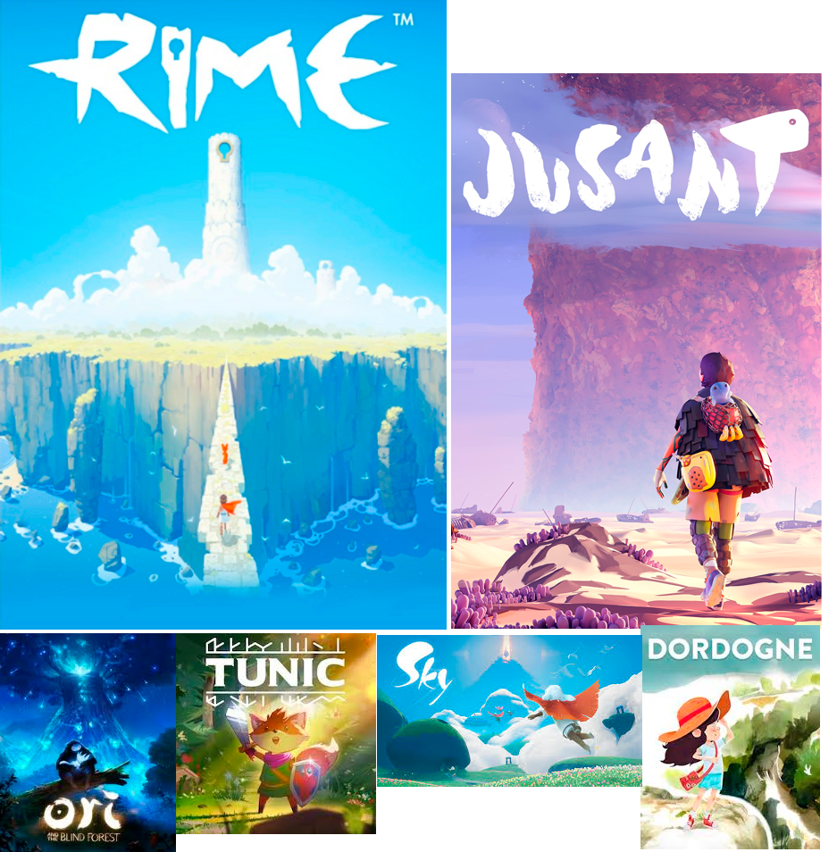
First, we created a moodboard of games we liked the logos to draw inspiration from.
To reach the stage shown in the first image, we went through a series of sketches that helped us grasp the idea we wanted to transmit.
To develop an interesting logo, we conducted several logo studies.

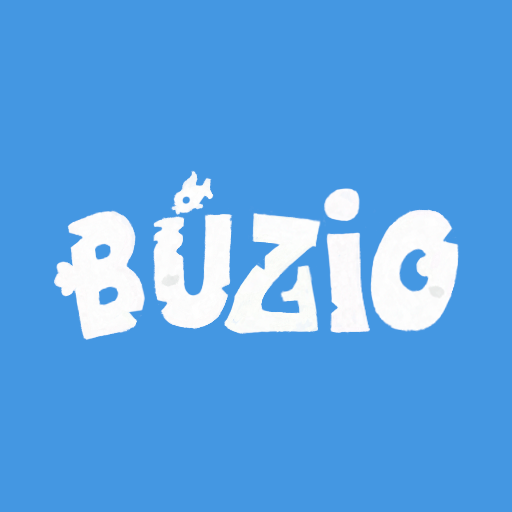
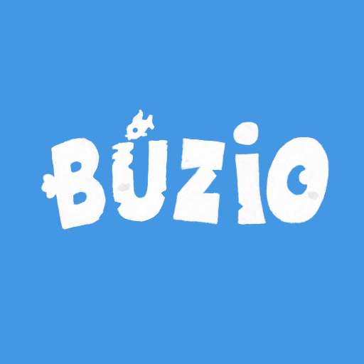

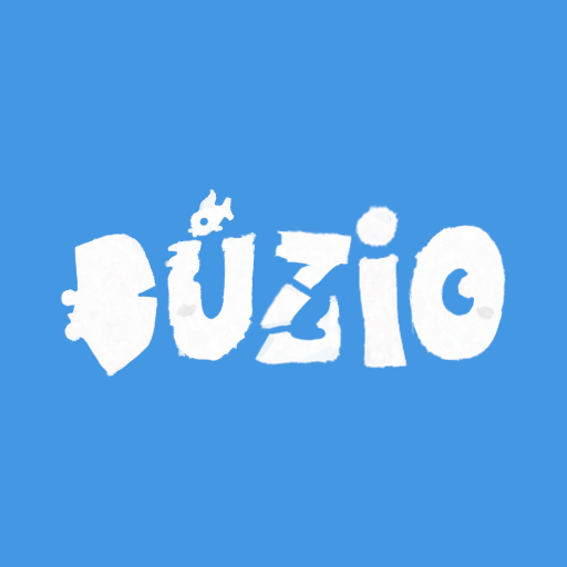
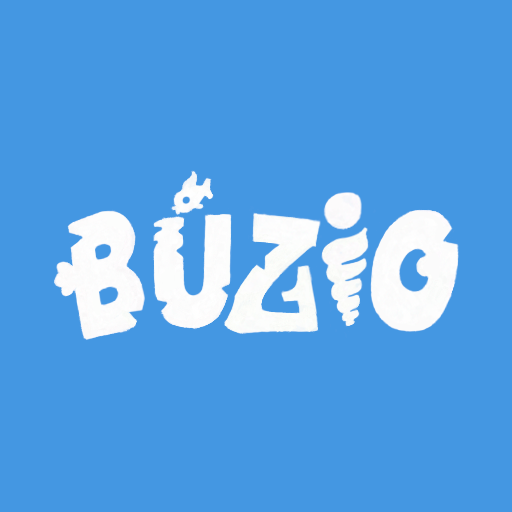
After these studies, we chose the last design and made some changes to the accent because we thought it might cause some issues.


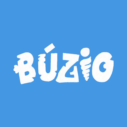
However, we didn't like any of those modifications, so we reverted to the original design and started testing some colors.
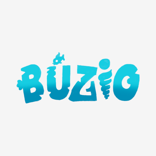
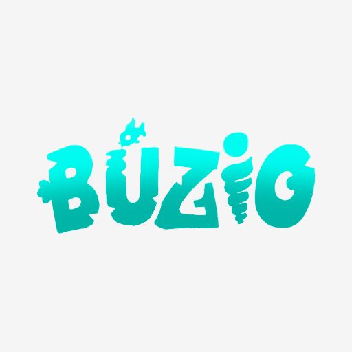
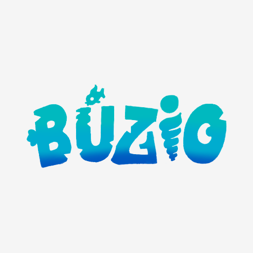
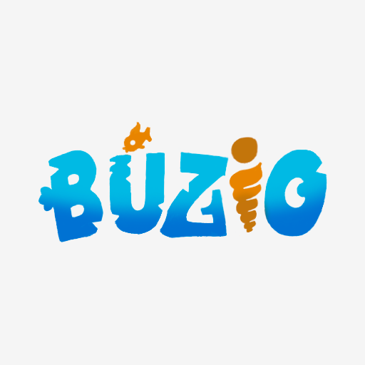
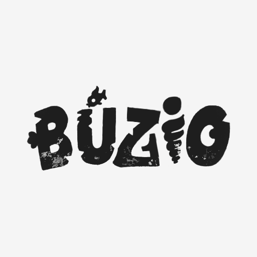

The colors we liked best were black for lighter backgrounds and white for darker backgrounds.
We hope you like our logo studies for our game, Búzio, and we look forward to sharing more with you next week!
If you have any questions feel free to ask in the comments.
